The London Design Festival is a citywide design event that takes place over nine days. The festival was created to promote the city’s creativity, drawing in the country’s thinkers, practitioners, retailers and educators to a deliver a diverse celebration of design.
London design festival has had some many big names in the design world to be commission to do an installation. Locations for these installations have included Trafalgar Square, Somerset House, V&A, Convent Garden and St Paul’s Cathedral.
I found the event enjoyable and the quality of the work London has to offer is breath taking. My favourite of the lot was the below video which was over at Somerset House
This installation was called House Motion. The design team is Tabanhogu Architects.
Description: Tabanhogu Architects’ installation considers the emotional meaning of home in an age of increasingly transient living. The pavilion starts with the most elemental idea of a house: a cubic form. This is created suing a series of white rods, a simple border demarcating the limiteds of the home. The gaps between the rods lend a semi-transparency to the structure, drawing visitors in but also allowing the home to dissolve into the wider environment. The walls, perhaps even the home itself, are seen to be illusory.
Upon stepping inside the structure, it again takes on the homely role of a shelter. A divan invites visitors into the heart pf the space, and in the evening, lights embedded in the rods transform the structure into a glowing lantern.
Below Is a video from again from the exhibition. This installation was celebrating Latvia. The installation was about Latvians living in harmony and nature. With the rapid development of modern technology and cities, it is important to be aware of the interaction and impact on the environment and nature, which is so essential in Latvian culture.
Latvia’s interactive installation consists of a meditative space, in which visitors can explore the relationship between people and nature.
The installation serves to comment on Latvian design, architecture and technology in the 21st century. Design with a long-term focus will create socially responsible and environmentally friendly design, that can coexist with nature and its inhabitants.
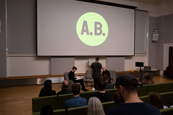
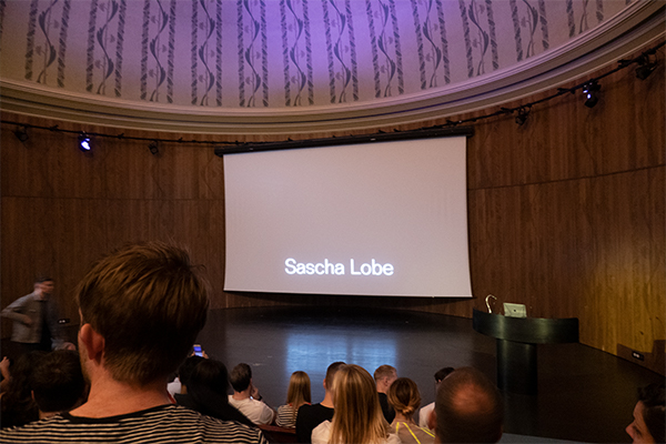
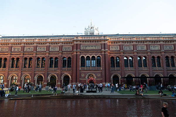
Graphic Design Forum Talks at the V&A
Talks by Anthony Burrill, Patrick Thomas and Sasha Lobe
About Anthony Burrill: Graphic artist, print-maker and designer Anthony Burrill is known for his persuasive, up-beat style of communication. His work is held in the permanent collections of the Victoria and Albert Museum in London, the Cooper-Hewitt National Design Museum, New York and has been exhibited in galleries around the world including the Barbican Art Gallery, the Walker Art Center and the Design Museum, London.
I especially like his posters. One in particular that I like and live by is the ‘Work hard and be nice to people.’ Also the poster ‘Make your mark on the world’. The use of letterpress feels very old school and for me relates back to the suffragettes posters.
About Patrick Thomas: Patrick Thomas (1965 Liverpool, UK) is a graphic artist, author and educator. He studied at Central Saint Martins School of Art and the Royal College of Art in London before relocating to Barcelona in 1991 where he founded the multidisciplinary studio ‘laVista’. In 2005 he published ‘Black & White’ a compilation of his work for the International Press. In 2011 Laurence King Publishing, London, published his second book ‘Protest Stencil Toolkit’, which sold out. He is currently working on the follow-up, due to be released in 2018.
Patricks work is similar to that of David Carsons. Very abstract grunge typography. His typographic layouts are very bold and exspressive. His work is sometimes political which is great because it gives more personality into his work and also what he stands up for.
About Sasha Lobe:
Sascha Lobe is a graphic designer working at the intersection of architecture and graphic design, he joined Pentagram as a partner in June 2018.
Previously, Lobe was founder and lead creative director at L2M3; where his work encompassed wayfinding systems, signage, print, branding and identity projects for some of the world’s most well-known companies and cultural institutions.
His clients have included Mercedes Benz, Vitra, Adidas, Hugo Boss, Kunstsammlung Nordrhein-Westfalen, Kunstmuseum Stuttgart and Württembergischer Kunstverein. Lobe also created the celebrated identity for the Bauhaus-Archiv Museum, and has collaborated with star-architects, such as Daniel Libeskind. In 2018, Lobe finalised an architectural branding project with David Chipperfield Architects, for the Amorepacific Headquarters in Seoul, South Korea.
Lobe has received over 100 international awards in all areas of visual communication; including the Type Directors Club New York, Red Dot Design Award and European Design Award. Lobe was appointed to the Alliance Graphique Internationale (AGI) in 2009 and is a Professor of Typography at HfG Offenbach. His printed art works are currently held by the design collections of Museum für Gestaltung Zürich, Neue Sammlung München, Kunstbibliothek Berlin, Bibliothèque Nationale de France and Museum Angewandte Kunst Frankfurt.
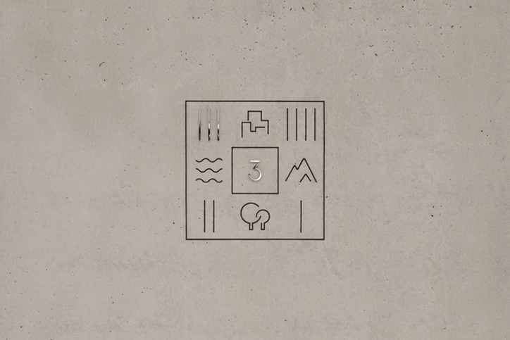
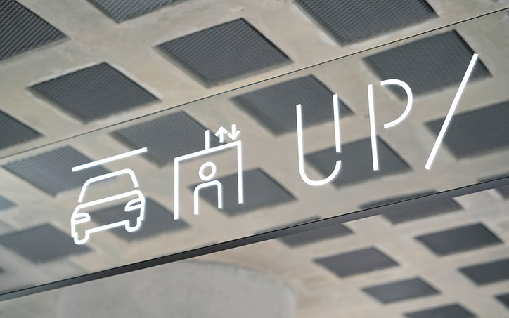
Sasha Lobe is no doubt a brilliant graphic communications designer. His work for Amorepacific headquarters, the largest cosmetics companies in the world is world class. It shouts elegance but also very thoughtful and clever. Sascha and his team decidedly designed a Hangul-inspired custom typeface to fulfil this criteria of readability. The letterforms, numerals and pictograms throughout the building are “pared-back, stencilled fonts”, constructed using the traditional Hangul method which fortifies “a balanced and consistent visual language throughout the space.”